Analytics & Optimization
How to Use the Link Activity Intensity Heatmap?
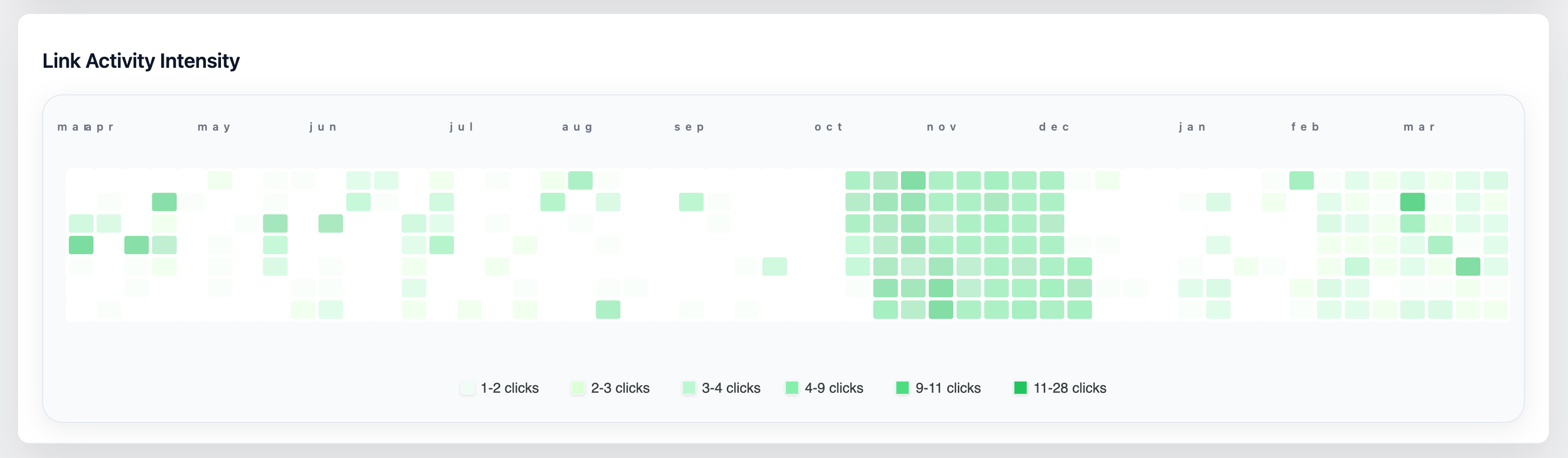
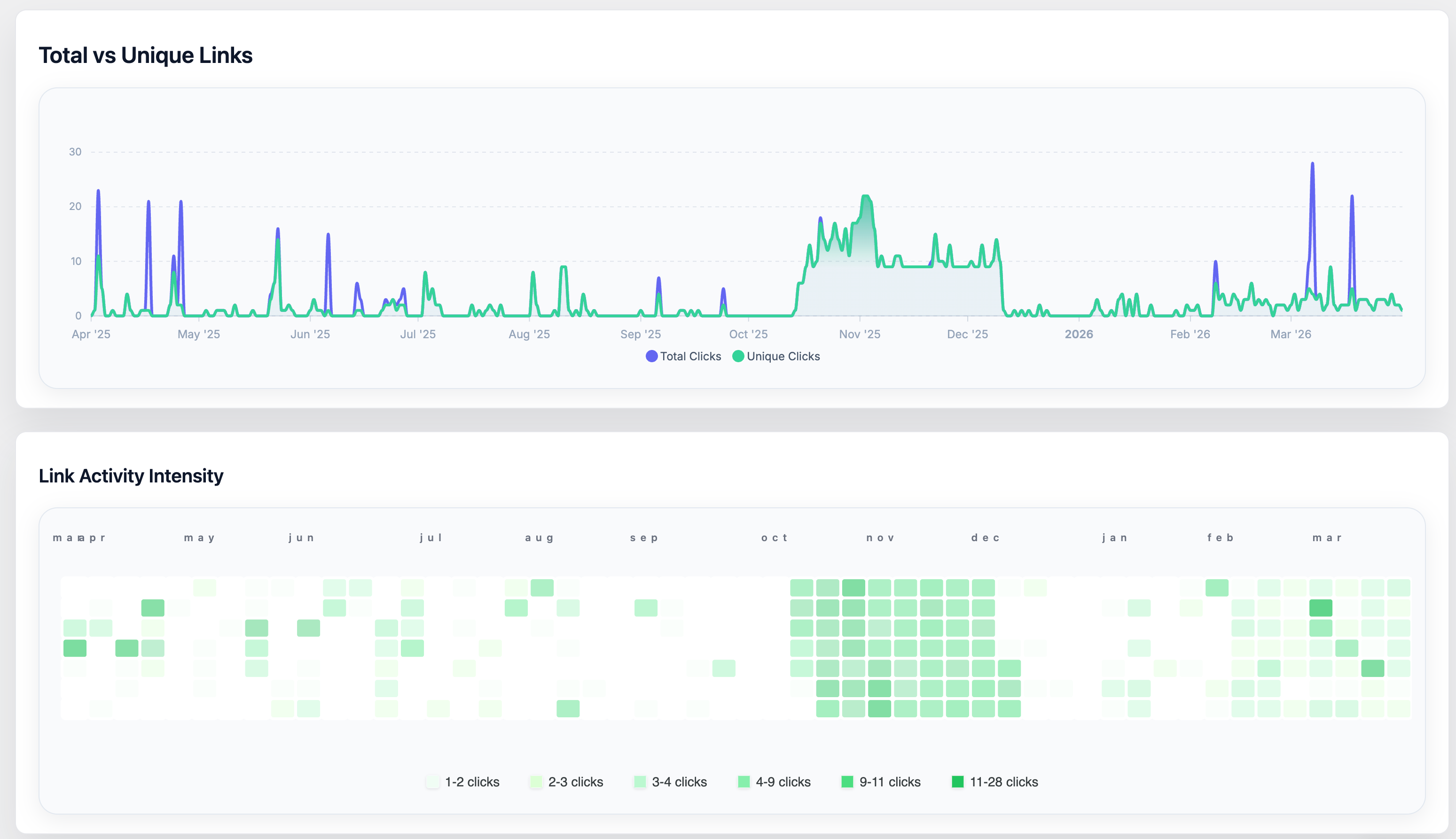
See When Your Links Come Alive — Link Activity Intensity Heatmap
Numbers tell you how many clicks you got. The Link Activity Intensity heatmap tells you when — at a glance, across an entire year.
Modeled after GitHub's contribution graph, the heatmap fills a 52-week calendar grid on your dashboard. Each square is one day. The darker the square, the more clicks happened that day. Pale squares mean quiet days; deep green squares mean your links were busy. You can read a full year of traffic patterns in seconds, without digging through tables or building custom reports.
What You Can See That You Couldn't Before
Most analytics tools show you a line chart of recent clicks. That's useful for watching a single campaign — but it hides the bigger story. The heatmap surfaces patterns that only become visible when you zoom out to a year:
- Recurring weekly rhythms — do your links always get more clicks on Tuesdays? Is Sunday consistently dead? The row-per-weekday layout makes this unmissable.
- Seasonal peaks — a cluster of dark squares every November and December tells you your audience is holiday-driven before you even run a campaign.
- Campaign fingerprints — a sudden burst of activity in an otherwise quiet stretch marks exactly when a promotion landed. You can see multiple campaigns side by side in the same view.
- Decay curves — a spike that fades over several days shows the natural lifespan of a share or press mention, so you know how long links stay "hot."
- Gaps and droughts — stretches of empty squares can reveal when your content publishing went quiet, when a link broke, or when a seasonal dip set in.
Insights You Get From the Heatmap
Best days and worst days to publish
After a few months of data, the heatmap will show you which days of the week consistently light up and which stay pale. If Thursday rows are always darker than Monday rows, you have real evidence for scheduling your next campaign launch on a Thursday.
Whether a campaign actually worked
You planned a promotion, sent an email, or ran an ad. The heatmap shows you whether that date produced a visible spike — and whether the momentum lasted one day, three days, or a full week. No filtering required; the evidence is right there on the calendar.
Seasonal demand for your content or products
If you run any kind of seasonal business — retail, travel, events, education — the heatmap will reveal your natural busy and quiet seasons after just one year of data. Dark squares cluster around the periods when your audience is most engaged.
Traffic consistency over time
A healthy, growing site tends to show gradually darkening squares as the months progress. If the heatmap shows irregular bursts with long empty stretches in between, that's a signal that traffic comes only from occasional pushes rather than from a sustainable audience.
The real lifespan of a shared link
When a piece of content goes viral or gets picked up by a newsletter, you often see a spike followed by a tail. The heatmap makes this tail visible — you can see whether a link continued generating clicks for a day, a week, or longer after the initial burst.
Use Cases
Content creators and bloggers
You share links to your latest posts, YouTube videos, or podcast episodes across social media and newsletters. The heatmap answers the question you always wonder about: which days does my audience actually click? Use it to find your best publishing windows and to see at a glance which content drops generated lasting traffic versus a one-day blip.
E-commerce and product businesses
Promotions, product launches, and sale events show up as distinct clusters on the heatmap. You can see how long a flash sale kept driving traffic, whether a product launch sustained interest into the following week, and which months bring your heaviest shopping traffic. Over time you build a visual record of what works and what fades fast.
Email marketers and newsletter publishers
Every send shows up in the heatmap as a spike on or around the send date. Compare sends side by side on the calendar: did last month's subject line outperform this month's? Did a re-send to non-openers add a second bump two days later? The heatmap turns your send history into a visual audit trail.
Social media managers
You manage multiple clients or channels, and timing matters. The heatmap shows you — without any manual analysis — which days your links consistently outperform others. Over a few months you can confidently tell a client "your audience clicks most on Wednesday and Thursday" backed by a full year of visual evidence.
Affiliate marketers
Affiliate links live or die by timing and consistency. The heatmap reveals whether a review post drives steady long-tail traffic or front-loaded traffic that dies off quickly. It also makes it easy to spot if a link stopped working — a sudden halt in an otherwise active row is a clear visual signal to investigate.
Event organizers and promoters
Ticket links, registration pages, and event landing pages have a natural deadline — the event date. The heatmap shows the classic demand curve: a slow build, an acceleration as the date approaches, and a sharp drop-off after. See at a glance how far in advance your audience acts and plan your promotional push accordingly.
Agencies and marketing teams
When reporting to clients, a year's worth of click activity compressed into a single visual is far more compelling than a spreadsheet. The heatmap communicates traffic patterns instantly and sparks the right questions: why was March so quiet? what happened in October?
Reading the Colors
The heatmap adapts its color scale to your data. Whether your site gets 5 clicks a day or 5,000, the full range of shades is used so that relative differences are always visible. You are always comparing your busy days to your quiet days — not to some global benchmark.
| Color | What it means |
|---|---|
| Very light green (or empty) | Little to no activity that day |
| Light to medium green | Below-average activity |
| Medium green | Around your typical daily traffic |
| Dark to very dark green | Your highest-activity days |
Hovering over any square shows the exact date and click count for that day.
Getting the Most Out of It
Let data accumulate. The heatmap becomes most useful after two to three months of consistent link use. Patterns only emerge with enough history to compare.
Check it after every campaign. After sending an email, running an ad, or publishing a post, glance at the heatmap a week later. Did the activity match your expectations? Did the tail last longer or shorter than you predicted?
Look for recurring patterns before planning. Before scheduling your next big push, check which weeks and days have historically been your strongest. Align your campaigns with natural peaks rather than fighting against quiet periods.
Combine it with the spline chart above. The spline chart shows total vs. unique clicks over time. Use the heatmap to identify when spikes happened, then cross-reference with the spline chart to understand what kind of audience drove them.
The Link Activity Intensity heatmap is available exclusively in URL Shortify PRO. It appears automatically on your dashboard once you have an active PRO license and your links start receiving clicks.